The Problem With Most KOL Briefs
Every week, at least two brands send us their KOL briefs for review. And every week, the same pattern: a 12-page deck with brand guidelines, mood boards, content pillars, messaging frameworks, three rounds of approval workflows, and a legal disclaimer longer than the actual creative direction.
The creators skim it. Or they don’t read it at all.
I don’t blame them. If you need a 45-minute onboarding call to explain a brief, the brief has failed. A brief should make a creator more effective, not more confused.
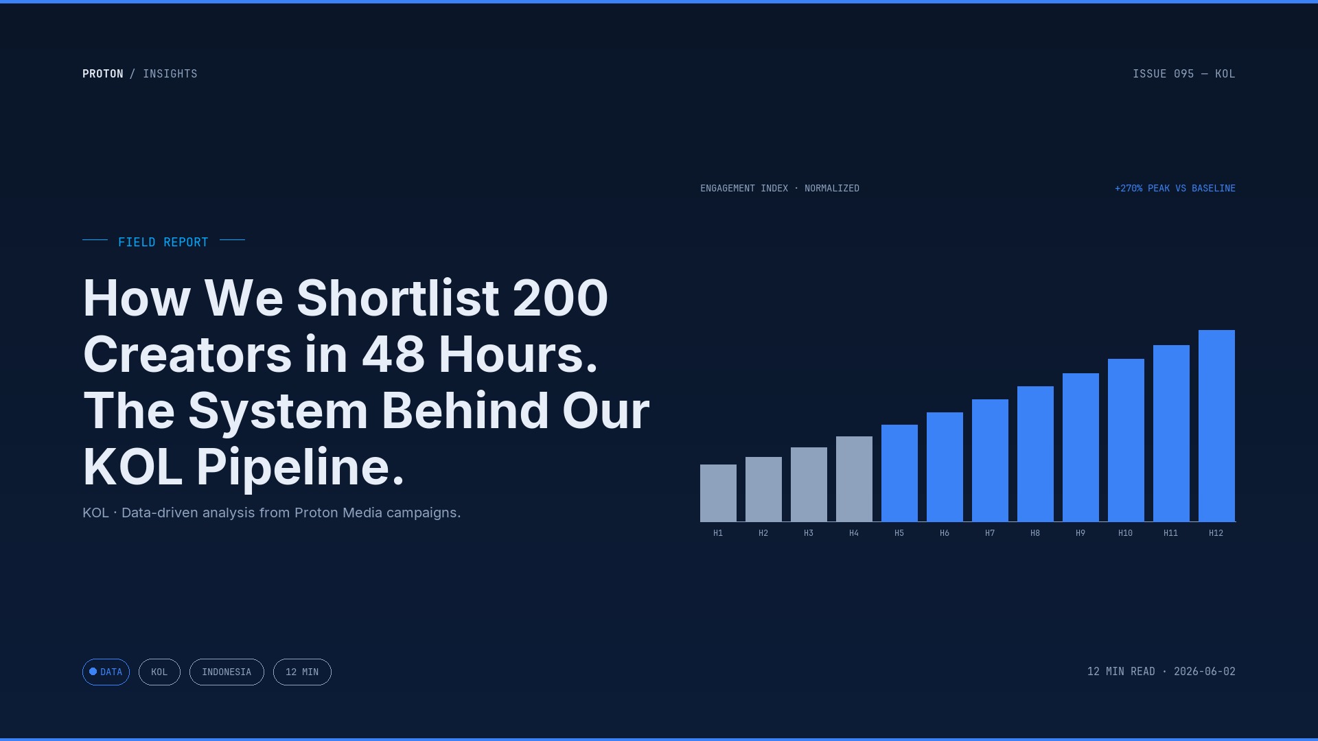
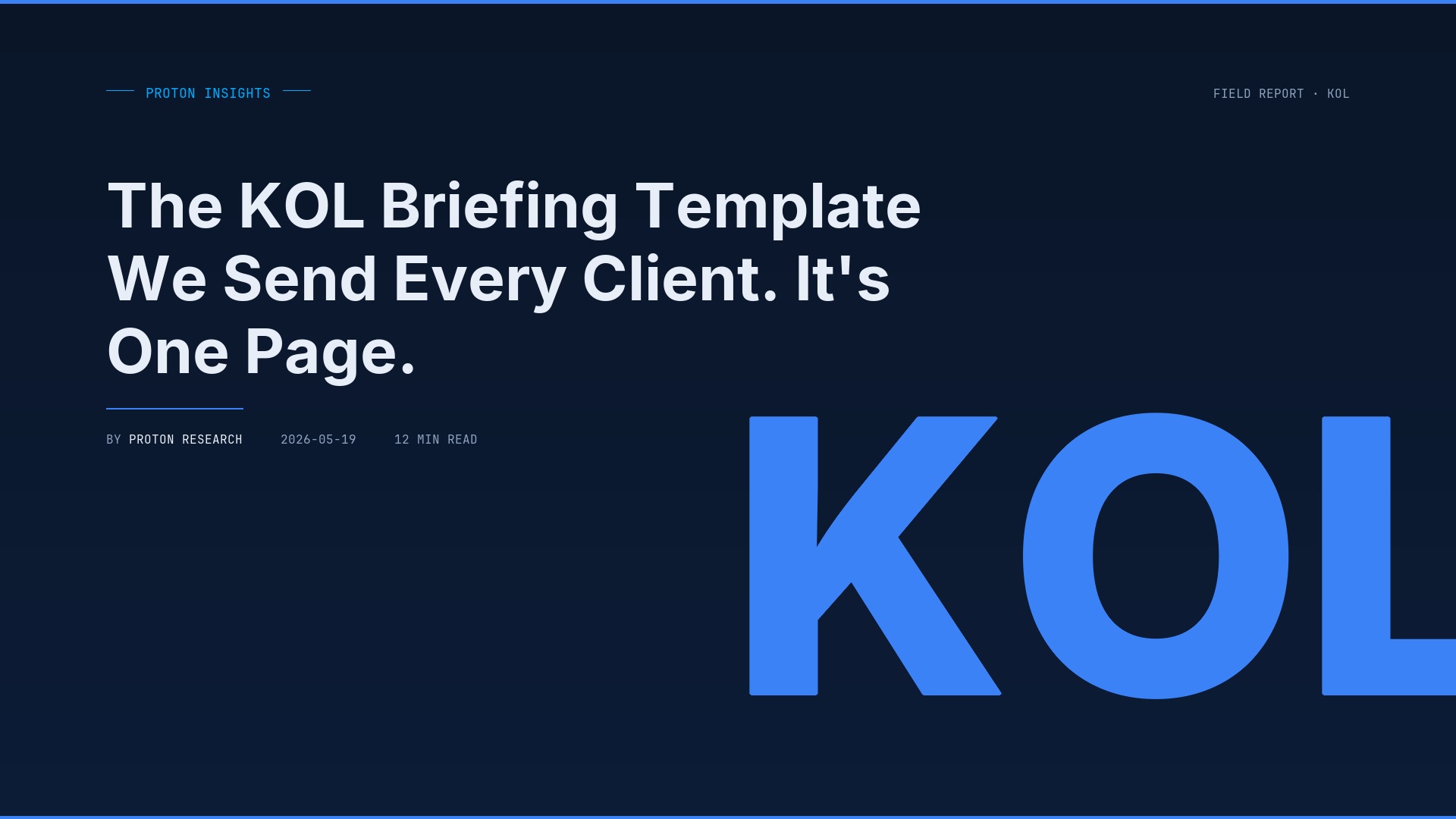
After managing 9,000+ creator partnerships, we’ve compressed our standard KOL brief down to a single page. One page, five sections, takes 10 minutes to fill out and 3 minutes to read. It’s the document we send every client, and it’s responsible for cutting our revision rates by more than half.
Why One Page Works Better Than Twelve
Creators aren’t employees. They don’t sit through your brand training module. They’re juggling 5-10 brand deals at any given time, filming content between meetings, editing at midnight. Your brief is competing for attention with every other brand in their inbox.
The brands that get the best content aren’t the ones with the most detailed briefs. They’re the ones whose briefs are impossible to misunderstand.
Three things happen when you cut a brief to one page:
- You’re forced to prioritize. When you only have one page, you can’t include everything. That constraint is the point. It forces you to decide what actually matters for this campaign.
- Creators actually read it. A one-page brief gets read in full. A 12-page deck gets skimmed — and the creator fills the gaps with assumptions.
- Revisions drop dramatically. Most revision requests come from misalignment on expectations. One clear page eliminates ambiguity.
Our internal data from Q1 2026: campaigns using the one-page brief format had a 23% revision rate. Campaigns where brands insisted on their own multi-page briefs had a 61% revision rate. Same creator pool, same product categories.
The Five Sections
Here’s exactly what goes on the page. Nothing more.
1. The One Thing (2 sentences max)
What is the single message you need the audience to walk away with? Not three messages. Not a primary and two secondary messages. One.
Bad example: “Communicate that our serum is dermatologist-tested, affordable, uses natural ingredients, and is available at all Indomaret locations.”
Good example: “This serum cleared my acne in 2 weeks — and it’s under Rp 100K.”
If you can’t distill your message to one sentence, your campaign strategy isn’t ready for creators yet. Go back to the drawing board before you waste budget.
2. Must-Show Moments (3 bullets max)
What absolutely needs to appear in the content? This is your non-negotiable list. Three items, maximum.
Example for a skincare brand: - Show the texture on skin (not just the bottle) - Mention the price point - Include the TikTok Shop link in bio or shopping tag
That’s it. Everything else is creative freedom. The more constraints you add beyond three, the more robotic and inauthentic the content becomes.
3. Don’t Do This (2 bullets max)
What will get the content rejected? Be specific and brief.
Example: - Don’t compare directly to [competitor brand name] - Don’t claim medical/clinical results
This section prevents the biggest disasters without micromanaging the creative. Most brands skip this section and then panic when a creator says something off-brand on camera. Two bullets of prevention save hours of crisis management.
4. Content Format + Platform
One line. What format, what platform, what length range.
Example: “TikTok video, 30-60 seconds, native style (not polished ad look)”
Or: “Instagram Reels, 15-30 seconds, with text overlay of key benefit”
Don’t leave this open. A creator who thinks you want a 3-minute YouTube review when you actually need a 30-second TikTok will waste both your time and theirs.
5. Timeline + Deliverables
Deadlines, draft submission process, and what you expect to receive. Three lines max.
Example: - Draft due: May 25 - Send via Google Drive link to [email] - We review within 48 hours, one round of revisions included
The single biggest source of creator frustration we hear: unclear revision timelines. “We’ll get back to you” isn’t a timeline. Give a specific number of hours or days, and stick to it.
What Stays Out of the Brief
Notice what’s missing from this template:
- Brand history and mission statement. The creator doesn’t need your founding story to make a good video. If your brand story is important to the content, include it in “The One Thing.”
- Detailed mood boards. Send reference videos separately if needed, but don’t clutter the brief. A link at the bottom with “Style reference: [link]” is enough.
- Legal terms and payment details. Handle these in the contract, not the creative brief. Mixing business terms with creative direction creates a document that serves neither purpose well.
- Audience demographics and insights. The creator knows their audience better than your deck does. Trust them on this. That’s literally why you hired them.
The Template in Action
Here’s what it looks like filled out for a real campaign (anonymized):
THE ONE THING: “I used to spend Rp 300K/month on face wash that didn’t work. This one is Rp 75K and my skin has never been better.”
MUST-SHOW MOMENTS: - Before/after skin texture (natural lighting) - Product packaging and price - TikTok Shop orange basket link
DON’T DO THIS: - No mention of “chemical-free” or “dermatologist-approved” (not yet certified) - No competitor brand mentions
FORMAT: TikTok, 30-45 seconds, day-in-my-life or get-ready-with-me format
TIMELINE: Draft link to drive folder by May 20. Feedback within 24 hours. Post by May 25.
That’s the whole brief. One page. A creator can read this during their morning coffee and start filming by lunch.
The Results We’ve Seen
Since standardizing this format across all our KOL campaigns in late 2025:
- Revision rate dropped from 58% to 22%
- Average time from brief sent to content posted shortened by 4 days
- Creator satisfaction scores went up — we survey our creator network quarterly, and “clarity of brief” jumped from 6.2/10 to 8.7/10
- Content performance improved — less revision pressure means creators put more energy into making the content good instead of making it compliant
The counterintuitive truth is that less control produces better content. When you give creators a clear target and room to be creative, they do what you hired them to do — create content their audience actually wants to watch.
When you give them a 12-page deck, they create content that satisfies your approval checklist. Those are very different things.
Still sending multi-page briefs and getting mediocre content back? We’ve templatized the process that works across 9,000+ partnerships. Grab a call and we’ll walk you through it.